 Complete carrier bag guide
 Complete paper bag guide
 Complete plastic bag guide
 Complete luxury bag guide
 Complete fabric bag guide
 All size guides
 Paper bag size guide
 Plastic bag size guide
 Luxury bag size guide
 Fabric bag size guide
 Event bags guide
 Retail bags guide
 Fashion bags guide
 Beauty bags guide
 Bottle bags guide
 Catering bags guide
 Eco-friendly bags guide
 Recycled bags guide
 Drawstring bags guide
 Tote bags guide
 Florist bags guide
 Gift bags guide
 Clear plastic bags guide
 Paper bag inspiration
 Plastic bag inspiration
 Luxury bag inspiration
 Fabric bag inspiration
 Plastic free inspiration
 Video inspiration
 CarrierBags.co.uk
 PrintedLuxuryBags.co.uk
 PrintedMailBags.co.uk
 CustomLuxuryBoxes.co.uk
If 6 iconic World Cup nations had a carrier bag, what would it look like?
Colour has a significant impact on how something feels. At the World Cup, colour becomes a huge part of each nation’s branding. Every team has a signature colour or a unique colour combination that is instantly recognisable.
From England's simple white and red to Brazil's unmistakable green and yellow, each nation becomes closely associated with the colours it wears.
Carrier bags work in a similar way. If some of the world’s most recognisable football nations had their own branded carrier bags, what would they look like? How would each carrier bag capture the unique character of that nation?
World Cup nations reimagined as carrier bags
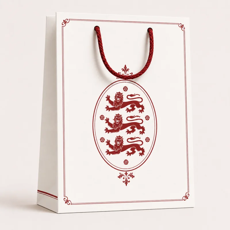
England
The English bag feels classic and rooted in tradition. The heritage-style lion motif gives the design a premium character without making it feel overly busy.
Design style: Classic, traditional, calm, composed.
Colour psychology: White provides a simple, clear background, while the red adds a feeling of confidence. Together, they help fashion a feeling of clarity, relaxed strength and tradition.
Perfect for: Heritage brands, premium retail, gifting.
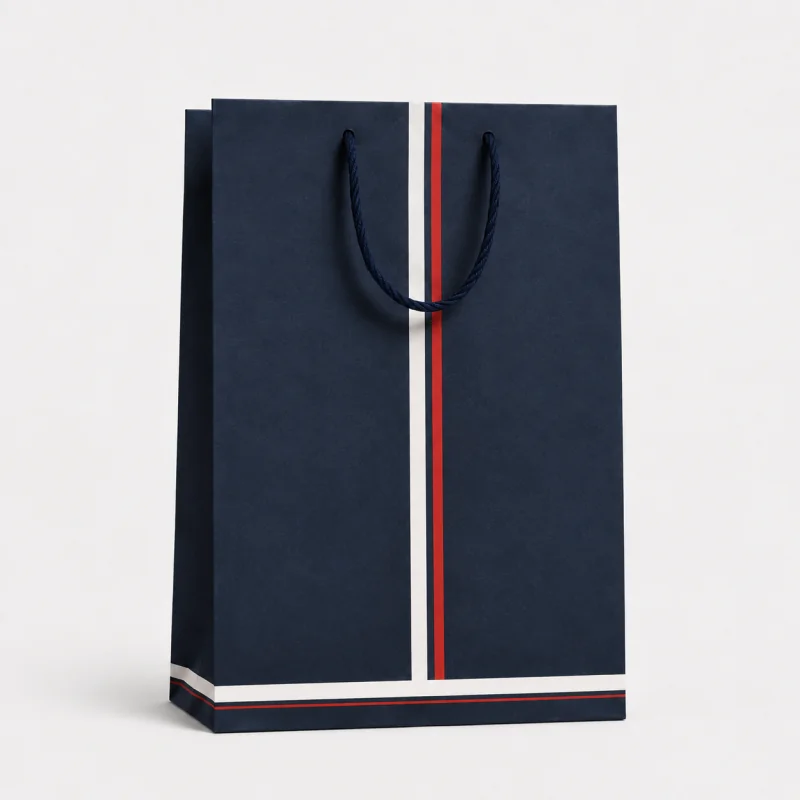
France
The France-inspired bag feels refined. Its deep navy base, paired with a narrow red-and-white detailing, creates a smart design with a distinctly premium feel.
Design style: Elegant, sophisticated, cultured.
Colour psychology: Navy can communicate prestige, while red introduces confidence and white adds contrast and clarity. Brought together, they create a premium bag with character.
Perfect for: Luxury fashion, cosmetics, jewellery, wine, premium gifting.
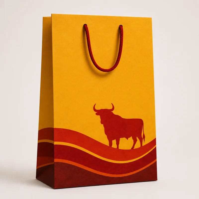
Spain
The rich yellow background and red detailing create an expressive design, while the bull silhouette adds a familiar Spanish reference that makes it instantly recognisable.
Design style: Vibrant, expressive, warm.
Colour psychology: Yellow can suggest optimism, while the red conveys a feeling of energy. Coupled together, the red and yellow helps fashion the impression of warmth and passion.
Perfect for: Food and drink, sporting events, summer promotions.
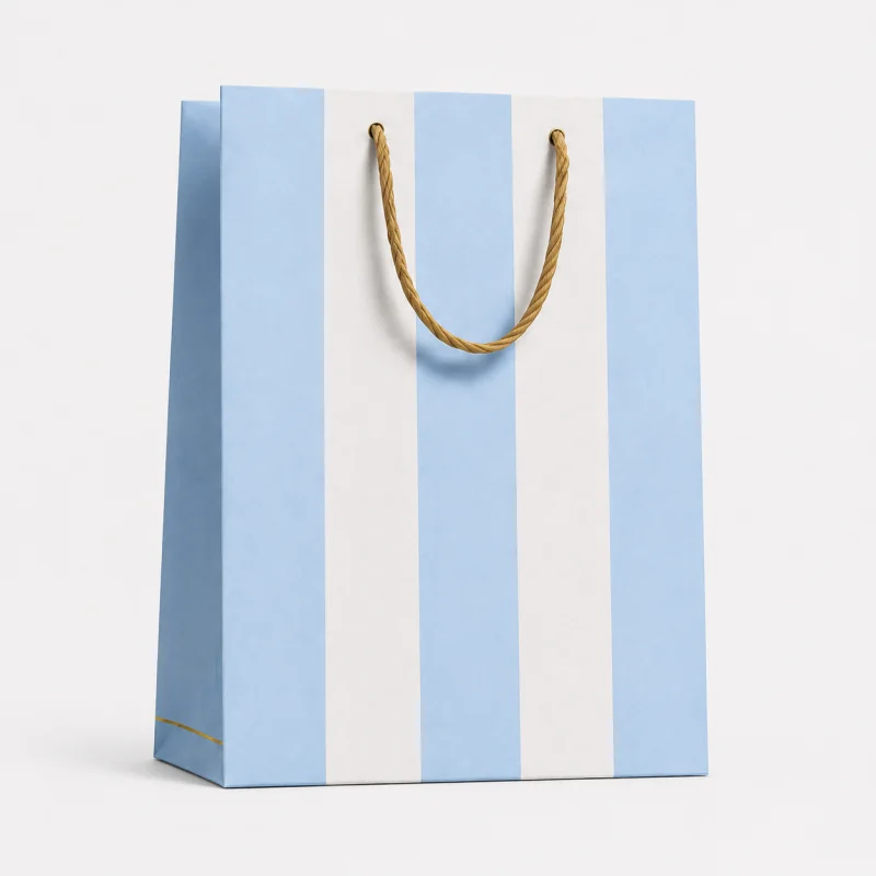
Argentina
The Argentina-inspired bag feels elegant. Its soft blue-and-white stripes with golden yellow handles create a classic design with a strong sense of pride, heritage and identity.
Design style: Light, minimal, elegant.
Colour psychology: Pale blue can suggest calmness, while the white creates a sense of simplicity. The golden handles add a subtle finishing touch for an elegant impression.
Perfect for: Travel, hospitality, gifting, lifestyle brands.
Brazil
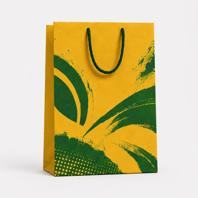
The Brazilian bag has flair. Its energetic design makes it difficult to miss. Sweeping green, brush-like details add movements and personality to create a vibrant impression of flair.
Design style: Vibrant, expressive, dynamic.
Colour psychology: Yellow can suggest energy, while green is often associated with growth, nature and freshness. Together, we're left with the feeling of vibrancy and vitality.
Perfect for: Sports, events, leisure brands, summer campaigns, food and drink.
USA
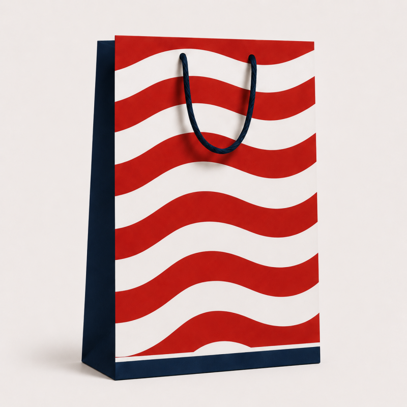
The USA-inspired bag feels bold. The flowing red-and-white pattern creates movement, while the navy details add structure and give the design a strong sense of pride.
Design style: Bold, ambitious, assertive.
Colour psychology: Red can suggest confidence. White adds clarity. Navy can communicate trust, strength and reliability. Together, they create an impression of boldness.
Perfect for: Sports, entertainment, retail, promotional events, lifestyle brands.
What can businesses learn from this?
Colour never works in isolation
The red in the English bag appears on the traditional lion motif, giving it a feeling of heritage. In the Spanish design, the red is paired with vibrant yellow, making it feel warmer. On the USA-inspired bag, the sweeping red-and-white pattern creates a bolder impression.
Although red appears across several of the bags, it creates a different impression in each design. Its shade, shape, placement and surrounding colours all influence how it is perceived.
The range of colour palettes
A colour palette is a curated selection of colours chosen to work harmoniously together for a specific design, brand or project. Different colour palettes can shape how a brand is perceived:
- A bright colour palette can feel fun, bold or energetic.
- A darker colour palette can feel premium, serious or refined.
- A minimal colour palette can feel clean, confident or professional.
- A more colourful design can feel expressive, memorable or attention-grabbing.
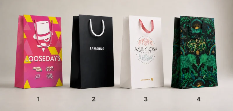
Colour helps set the tone, while the material, print, handles, shape and size all contribute to the overall impression. Whether you want your brand to feel premium, playful, bold, traditional or modern, the right carrier bag can help communicate that message instantly.
FAQs
National colours create an immediate sense of identity and recognition. They connect teams with their history, culture and supporters, helping fans recognise and rally behind their nation both inside and outside the stadium. National football colours can inspire the palette, patterns and overall character of a carrier bag. These colours can be combined with subtle shapes, graphics and finishing details to capture the unique personality of a nation without directly copying its flag or football kit. Bright, contrasting colours such as yellow, red, orange and green tend to stand out most clearly, particularly in busy retail environments. However, the most effective colour is one that attracts attention while remaining consistent with the wider brand identity. Bright colours can make a brand feel playful, energetic and approachable, while darker colours often feel more premium and refined. Minimal or neutral colours can communicate simplicity and professionalism, whereas bold colour combinations can make a brand appear expressive and attention-grabbing. Bright colours can make a brand feel playful, energetic and approachable, while darker colours often feel more premium and refined. Minimal or neutral colours can communicate simplicity and professionalism, whereas bold colour combinations can make a brand appear expressive and attention-grabbing.
Why are national colours so important at the World Cup?
How can national football colours inspire a branded carrier bag?
Which carrier bag colours are most effective at attracting attention?
How do I choose the right brand colour for a carrier bag?
What do different carrier bag colours say about a brand?
A winning design starts with the right bag
At CarrierBags.co.uk, we’ve helped thousands of businesses create custom-printed carrier bags that look professional, feel on-brand and leave a lasting impression.
Whether it's paper, luxury, fabric or plastic, we specialise in creating tailored printed carrier bags that are unique to your specific application. This elevates your customer's experience and makes you stand out from the crowd of competition.


